One of the most important factors when creating a unique and recognizable design is color. The right choice of color scheme can determine the success or failure of a website. When a visitor takes their first look at a web page, the colors you choose send them an instant message about that page. Luckily, there are many tools to help you choose the right color scheme. Here are five of the best.
1. Cooler
Kuler from Adobe has long been recognized as the best assistant for a professional web designer. Unlike competitors, there is a large community here and you can share created palettes or take other people’s color schemes and modify them to suit your needs. To communicate in the community, you need to register and get an Adobe ID. Colors in Kuler are represented in a variety of formats, including RGB, CMYK, LAB and HSV.

Inspiration can arise under the influence of the most unexpected occasion. For example, you may come across a beautiful photo with an attractive color scheme. This color palette generator was created just for processing such photos. Upload files in JPG or PNG formats and get a detailed layout of key colors. No matter what reaction you're trying to evoke in your visitors, a color palette generator can help create a unique look for any website.

Individual colors never hang in a vacuum, and each shade has an impact on its surroundings. The Contrast-A tool takes a highly technical approach to palette configuration, providing detailed information about the Luminance Ratio and differences in brightness and color. This is the perfect tool if you want to create a minimalist website with few colors that complement each other.
This popular Firefox plugin allows you to determine the meaning of individual colors directly in the browser and measure the difference between them. There is a “color scheme browser” for selecting individual colors from pre-selected sets. Easy to use and extremely feature-rich, the ColorZilla plugin is like the Swiss Army knife of browser extensions for web designers and artists.

Unlike most other "color wheel" color scheme generators, Colorotate displays the palette on a 3D cone. Like Kuler, users can save and edit their color schemes, as well as view palettes made by other designers. The tool is integrated with popular design programs Adobe Fireworks and Photoshop.
When it comes to effective web design, we talk about intuitive user interfaces and layouts, but color schemes matter just as much, if not more. The tools listed here should point you in the right direction to choose a great color palette for your website on the first try. There are other useful tools you can find online, but these are the ones you can start with to find the perfect arsenal to suit your personal style. Good luck and happy designing!
Choosing a color palette is always a difficult task, be it designing a website or mobile application. You shouldn’t choose colors carelessly, because a well-chosen palette sets the style for the entire site.
Every time a new web design is developed, a lot of time is spent choosing different color combinations. Alternative color palette tools can save you time in the future.
There are a large number of applications for selecting a color palette, but in this list we selected tools that are slightly different from standard programs.
A site with a self-explanatory name, where information about color is collected and presented in detail. It is more like a developer tool, where there are additions and subtractions, the creation of gradients is available with an exact indication of the color code in all possible color spaces. This approach is convenient for those who have free time, as well as an inexplicable love for calculations.
Friendly and warm “lamp” service that pleases you from the first minute of meeting you. The logic of the site is that you choose “one color”, and the service offers suitable solutions for it: a gradient, a range of the darkest and lightest shades, slightly muted or bright shades of the selected color.

Unlike previous services, this site demonstrates ready-made, selected palettes that show how colors interact with each other in the attached photographs. Looking at sea waves or flowers, you are amazed at how rich nature is in its creative impulse, and how poor our knowledge of color is. Overall, this is a valuable resource for those just starting to understand color combinations and who love pretty pictures.

As the author describes his resource: “I made the 0to255 website to simplify my work.” Web designers and people in similar professions work with flowers every day. When choosing the right one, they need its various shades, and using this service you can easily save time without burdening yourself with editing the hexadecimal code.

A solution for those who like to find colors in images. Just upload an image and the service will display a palette of primary colors with a hexadecimal code.

Who might need an application for selecting color solutions for a tablet? Probably for those who not only work with color, but live with it, or people with the ability for synesthesia. The site offers similar, but slightly reduced interface functionality designed for a tablet. Unfortunately, the site has some shortcomings; for example, the 3D spectrum, which is a feature of the site, turns out to be inconvenient to use.


In American TV series, they often say the phrase “Only if you were the last man on earth,” in our case, “If you don’t have any graphics editor at hand.” Dry, usually uninteresting. There is no charm or desire to interact in it; apparently, the product has not been developed for a long time.

It’s hard to call this site simple, because the creators have included everything that could be needed when working with color. It has everything: a large selection of collections, channels, trends, various types of tools for creating patterns, searching for colors by image. In general, everything your heart desires.


Summarize:
Despite the variety of services for choosing colors, Adobe Kuler, in the opinion of our editors, can be called the best, judging by the possibility of choosing color combinations.


One of the main advantages of this color mixer is the ability to save your selections, view selected colors in full screen, as well as share your finds and look at others. And for those who no longer want to part with this service even for a minute, there is a plug-in for Photoshop that allows you to use the program without leaving the editor.
A designer in the digital age, of course, does not need to be limited by the colors that can be obtained from paints, inks or other pigments, although there is also much to be learned from the approach to color in works of fine art. The human eye can differentiate between millions of different shades, but sometimes even combining two colors can be challenging.
Amazing color properties
This is because the choice of shades for design is very subjective and requires certain knowledge. So what should designers do if they want to put together a beautiful color palette that can make a client happy? Whether you like it or not, the best color combinations go beyond just personal preference, as they have the amazing ability to influence mood, emotion and perception, take on cultural and personal meaning, and attract attention - both consciously and subconsciously.
The challenge for designers and marketers is to balance the complex functions of shades to create an attractive and impactful palette of color combinations. This is where a basic understanding of color theory comes in handy. It can help you understand which tones work well together (or not) and what effect different combinations within a given design will create.
a color scheme
At school, children study this topic in art lessons, so everyone is probably familiar with its stripped-down form: red, yellow and blue basic tones. The traditional color wheel consists of 12 tones and is often used by artists. This is a simple visual way to understand color relationships.
The main task performed by the color wheel is color combination. Mixing the base or primary shades (yellow, blue and red) forms secondary shades: green, purple and orange. Combining them with the main tone allows you to get the third level of the circle - tertiary colors. These include red-orange, green-blue, blue-violet and violet-red. Primary and secondary tones are part of the visible spectrum, or the colors of the rainbow. Their order is easy to remember using the mnemonic phrase “Every hunter wants to know where the pheasant sits”: red, orange, yellow, green, light blue, blue and purple.
This way of understanding color is known as the subtractive model, which involves mixing pigments such as paints or inks, and is used in both the traditional color wheel and the CMYK system used in printing equipment. It differs from the additive model, which involves mixing light of different frequencies (for example, on a computer or TV screen) consisting of a different set of red, green, blue (RGB).
Graphic editors use a different version of the color wheel. Any shade can be selected using its hexadecimal code.

Terminology
Before compiling palettes, you need to master the terminology that will help you understand the different types of shades:
- hue is a synonym for color and traditionally refers to one of 12 colors;
- brightness: the degree of distance of a color tone from black;
- lightness: closeness of tone to white;
- saturation - the intensity or purity of a color (the closer a hue approaches gray, the less saturated it is).
The best color combinations
From the color wheel there are a number of classic palettes that have been used by artists over the centuries. For most design decisions, one dominant color should be identified from these schemes - by the amount of its use or by its selection from other tones - one or more accents:
1. Monochrome scheme: the use of different brightness, lightness or saturation of tones of the same color in the range from light to dark. An example of a successful monochrome combination is red with black and white. This scheme provides a slim and conservative design. Blue and white is a classic combination of Chinese porcelain from the 9th century. and French textiles of the 18th century.

2. Similar ones located side by side on the color wheel. It is universal and easy to use when developing projects. An example would be the combination of purple and blue-violet.
3. Complementary scheme: uses tones located at opposite ends of the color wheel. For example, blue and orange, red and green. Complementary colors have high intensity and contrast, but are difficult to apply harmoniously and balanced in their pure form as they can easily clash in a design.
4. Split-complementary scheme: any tone on the color wheel plus two colors bordering its complement. For example, yellow with green and red-violet. This scheme also has a strong visual contrast, although weaker than the previous one. Provides the best color combinations for design beginners as it is difficult to mess up.
5. Triadic scheme: any three tones evenly distributed on the color wheel. Provides quite bright combinations, even if the tones are pale and desaturated. For successful use, it is necessary to achieve complete balance - one color should become dominant, and the other two should be accents.
6. Tetrad, or double complementary: consists of two complementary pairs. This scheme is extremely attractive, but is more difficult to use than one pair of complementary colors, because more tones are more difficult to balance. When using this scheme, you should choose one color as the dominant color and adjust the saturation, brightness, and lightness of the hue of some or all of the tones so that they provide the best color combinations in different parts of the design.

Inspiration
In addition to color wheel combinations, nature offers many ready-made solutions for harmonious color schemes.
Options for pairing colors include considering their temperature (hot or cool), saturation (bright colors often look youthful while pale ones look vintage), mood (bright and cheerful, dark and serious), theme (location, season, holiday), and other qualities.
Another great technique for finding color is to look to different historical periods and artistic movements for inspiration: the warm, light colors of the Impressionists; bright, unexpected combinations of post-impressionists; soft, earthy Art Nouveau colors; bright, bold shades of pop art.

Psychology of color
Color surrounds us. Whether we realize it or not, it plays a big role in our daily lives. Have you seen an orange or yellow road sign on the road today? He attracted attention for a reason. Color has an amazing connection with our moods and emotions.
But not everyone experiences color the same way. The meaning and symbolism we associate with different tones is highly dependent on the influence of the cultural and social groups to which we belong. Here are some common meanings associated with primary colors in Western culture.
Red
This color conveys many different ideas depending on the context. Associated with fire, it can symbolize warmth or danger. Because red is the color of blood, it is considered an energetic, lively tone and is therefore associated with matters of the heart and sometimes violence.
Alternative Meanings: In some Eastern cultures, red symbolizes good luck and prosperity and is the color worn by brides on their wedding day. Throughout the world, red is associated with various political movements and symbolizes revolution.
In branding: often denotes strength, confidence and power and is highly visible.
Orange
Also the color of fire, orange combines the warmth of red with the cheerfulness of yellow and symbolizes activity, energy and optimism. Also associated with the harvest or autumn.
Alternative Meanings: In India, saffron, which has a yellowish tint to orange, is considered sacred. In Japan, color symbolizes love.
In branding: often represents youth and creativity. Gold, which is also a shade of orange or yellow, symbolizes luxury and high quality.
Yellow
As the color of the sun, it often symbolizes the happiness, cheerfulness, friendliness and freshness of spring. In addition, in certain contexts it can convey a warning signal or warn of caution. Some variations (especially the desaturated and greenish ones) look sickly or unpleasant, which is not surprising since historically yellow is sometimes associated with illness and quarantine.
Alternative Meanings: In some Eastern and Asian cultures, yellow is associated with high birth or status. In some parts of Africa and Latin America, this tone is the traditional color of mourning.
In branding: A clear or bright yellow tone attracts attention, but can be unsettling or even difficult to see (such as white text on a bright yellow background or vice versa) if used carelessly.
Green
It is the color of nature, vegetation and growth. It often symbolizes health, freshness, or natural qualities. Dark green can represent wealth and stability.
Alternative Meanings: Among Islamic cultures, green is a sacred color. It is also associated with Ireland, St. Patrick's Day and the lucky four leaf clover.
In branding: Brands or products marketed as “green” (natural, healthy, eco-friendly, organic, etc.) often use natural colors such as green and brown.
Blue
The color of the sea and sky, it often symbolizes peace and purity. Unlike more energetic and warm tones, blue is perceived as calming. In some cases it can represent sadness or depression.
Alternative Meanings: In Middle Eastern cultures, blue traditionally protects against evil. Because of its association with the sky, in many cultures the color symbolizes immortality and spirituality.
In branding: Blue is widely used and is one of the most versatile colors. It usually symbolizes reliability, security and stability. The tone is particularly popular in corporate contexts as it is perceived as having serious, conservative and professional qualities.
Violet
Traditionally associated with nobility, greatness or honor. Thus, it has spiritual, mystical or religious connotations.
Alternative Meanings: In many cultures around the world, the combination of purple symbolizes nobility or wealth, however in Thailand and parts of South America it is associated with mourning.
In branding: dark shades of purple are often a symbol of luxury, while lighter and brighter shades are popular with women and children.
Black
Like red, this color has many (sometimes conflicting) meanings. It can represent power, luxury, sophistication and exclusivity. On the other hand, black symbolizes death, evil or mystery. In clothing, it is a symbol of formality or mourning and grief (as mourning is traditionally worn at funerals).
Alternative Meanings: In some Asian and Latin American countries, black is considered a masculine color. In Egypt it means rebirth. In many cultures, color is associated with magic, superstition or bad luck, as well as the inexplicable or unknown.
In branding: Black is so widely used that it has almost become neutral, although it can symbolize the above depending on the context. Many designs are simply black and white (either deliberately or simply to save on color printing).
White
As the color of light and snow, white often symbolizes purity, innocence, goodness or perfection (traditionally worn by brides), but also signifies austerity or sterility.
Alternative meanings: In China, white is the color of mourning. In many cultures it signifies peace - the white flag is a universal symbol of truce or surrender.
In branding: white often communicates simplicity, purity or modernity. Designers seeking a minimalist aesthetic often use a lot of white.

Color in design
Choosing a color combination is more than choosing two or three shades and distributing them in equal proportions throughout the design. Using them effectively has a lot to do with balance, and the more tones you use, the more difficult it is to achieve.
The easiest way to implement this concept is by dividing the selected colors into dominant and accent colors. The dominant tone will be the most visible and most used in the design, while one or more accents will complement and balance it. Paying attention to the interaction of colors - the presence or absence of contrast, how adjacent tones look, what mood the combination of colors and shades creates, etc. - will help you accurately select the ideal palette for design purposes.
The generally accepted rule for using a basic three-color palette is the 60-30-10 rule. This approach is often used in interior design, but can also be used effectively for web or print design. It is enough to devote 60% to the dominant color, and give the remaining 30% and 10% to the two accents. A good example to explain this rule is a men's suit: the jacket and trousers account for 60% of the color of the garment, the shirt takes up 30%, and the tie the remaining 10%. All together provides a balanced, elegant appearance.
Another way to keep your palette simple and balanced is to use brightness and lightness (or lighter and darker versions of your chosen hue). This way you can expand your color selection without overwhelming the design.

and branding
Brand recognition is highly dependent on color. Just think of Coca-Cola, Facebook or Starbucks, and it’s easy to remember the tones with which these brands are associated.
A study conducted at the University of Winnipeg found that people's initial judgments of products are largely based on color (60-90% of evaluation). This means that tone in design is not just an artistic choice, but also a critical business decision that affects everything from how consumers perceive a brand to how products are sold.
However, when choosing a color scheme for a logo, it is not necessary to adhere to traditions, symbolism or stereotypes. There's no foolproofing or quick rules here. What's more important is how the tone is used in the design and harmonizes with the brand's market context and character.
RGB vs CMYK
When working on a printed project, your computer monitor cannot display colors the way they will appear on paper. What you see is not what you get because digital monitors and printers use two different systems: RGB and CMYK. The first refers to the small points of red, green and blue light that combine to form visible colors on the screen; the second means cyan, magenta, yellow and black tones for creating color prints. Because RGB uses a wider spectrum than CMYK, some designers initially create a print design in RGB to retain more color options and convert the finished design to CMYK before printing.
For this reason, they need a tool that provides color consistency across both systems - for example, when designing a logo for a website and printing it on a business card. One such system is the Pantone Matching System (PMS). Here, tones can be matched across web and print (and across different types of printed surfaces) to ensure a consistent look.

Color: understand, explore and love it!
Designers specialize in the study of color theory, psychology or neuroscience - complex subjects that lie at the intersection of art and science. But that's part of what makes this profession so interesting and such an effective tool in the marketplace. Although this guide only outlines the basics, it is hoped that it will help make more informed and more effective color choices for personal or professional projects.
Colors play a huge role in web design. To correctly select a color scheme for a website, there are special services. I'm sure every web designer has at least one of these in their bookmarks.
Sometimes you sit and think what shade of blue to choose as the main one for the site, a little lighter or a little brighter, or maybe darker... And you still need to choose additional ones for it. You can, of course, do this by eye, but it is better to use one of the special services.
I will not talk about color theory (this is too voluminous information), but will simply publish here the services that I have in my bookmarks and that I use.
I have been friends with this instrument for many years. The most convenient tool for selecting colors (in my opinion). It has many additional features. For example, you can see an example of a light and dark page with selected colors.
It is possible to evaluate how people with color blindness and other visual impairments will see your color scheme. You can choose web safe colors.
Adobe Kuler is the second web tool that I use quite often. The selection of color schemes is almost the same as on the previous site, but that’s not why I love it. In addition to creating color schemes yourself, you can look at and use schemes that other people have created.
To do this, click the button in the top left menu “Watch”. And a gallery of all kinds of color combinations will open in front of you.

This tool is a bit similar to Colorscheme, but has fewer functions, but you can see what color blocks will look like.
I practically don’t use this site, but since I have it in my bookmarks, I decided to add it too.

The following two sites generate a palette from the image you select. It is magic:)
You choose any picture whose colors you like, the service analyzes it and gives you a color palette. The only difference between these two sites is how they provide the image.

This site requires download picture from your computer.

A very convenient tool for color selection. Based on the “Like - Dislike” principle.

As the name suggests, here you can choose colors for the now fashionable flat design. The site is interesting because once you select a palette, you can download it for Corel and Photoshop.

Another fashion trend is material design. This site helps you choose color combinations for the UI (user interface). Additionally, the site has a large set of icons.
Color is one of the most important elements in a designer's work. But as a concept, it can be quite difficult to master: due to the many combinations of palettes, it is often difficult to decide how best to design the interface of web pages and applications. We have previously published reviews of tools of choice and . And today we want to expand the topic by posting a translation of the article Essential Color Tools for UX Designers by Nick Babich on the blog.
The note contains a list of the best color selection services for websites and UX design that will help you save a lot of time. Through these projects you will learn:
- where to get inspiration from;
- how to create your own palette;
- how to make design accessible to people with color vision impairment.
1. Looking for inspiration
Colors of nature
Draw from the world around you. All you need to do is just look around. Fashionable clothes, book covers, interior design... there are so many amazing things around you. But the best color combinations are the colors of nature. Capture a beautiful moment and try creating your own selection based on a specific image.
The best color combinations are found in nature. You can get a color scheme from any photo
Behance
In this popular service you will find interesting works included in the best online portfolios of real professionals in their field. This site is also a great source of inspiration. To view new worthy examples of projects, simply select the color you want.

Dribbble Colors
Dribbble is one of the best that will come in handy when creating a user interface. If you want to visually understand how others have used a particular color, go to dribbble.com/colors and enter the value you want.

When choosing a color for a site, here you can set its minimum percentage - experiment, for example, try setting 30% blue.

Try setting a minimum percentage of a specific color in Dribbble
Design inspiration
Designspiration is a useful tool primarily for those who already have ideas for color combinations and want to see examples of such combinations. Select from 1 to 5 options and you will find pictures that match the specified parameters.


In Designspiration you will find different examples of color combinations
Tineye Multicolr
Using the Tineye Multicolr color matching service, you can determine the desired gamma of the image and even set the percentage of each of them (ratio). The site is integrated with a database of 20 million Creative Commons photos from Flickr. This is definitely one of the fastest ways to find the perfect palette.

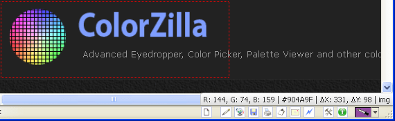
Colorzilla
ColorZilla is an extension for installation in Chrome and Mozilla Firefox browsers. It includes tools such as eyedropper, palette browsing, creation, and more.

ColorZilla extension available in Chrome and Firefox
Shutterstock Spectrum
One of the best ways to imagine what a color scheme will look like is to look at the corresponding images. Most solutions that offer color choices for website designs include this feature, but Shutterstock Spectrum has an incredibly user-friendly interface and preview that can really be useful.

Moreover, you will not need a subscription, since a preliminary assessment of the picture will be quite enough (even though it has a “watermark”).
W3Schools

Recently the blog reviewed a selection from W3Schools. There is a lot of information collected there on the topic, starting from their names/codes of shades, the theory of combining palettes and ending with a description of different formats: HEX, RGB, CMYK, HWB, etc. You will also find simple generators, converters and similar “mini-services”. Overall, interesting to watch.
2. Create a color palette
Material Design Color Tool
The Material Design Color Tool allows you to create, share color schemes, and view a rough user interface for your selections. One of its useful functions is to measure the accessibility level of any color combination.

Coolors
Coolors is a site for creating a multi-color palette. Just pin a specific color and press the space bar. The tool is also good because you will get more than one result, but you can generate several options by changing only the initial data.


Color scheme in Coolors based on photo
Adobe Color CC
The color matching service Adobe Color CC (formerly Kuler) is now quite popular. It is freely available on the Internet, but there is also a desector version. With this web application you will make your own palette using the color wheel:

Or you can get a certain result from the finished image:

Selecting colors for a website based on a picture
There are hundreds of ready-made combinations here, look for them in the “Watch” section:

If you use the desktop version, you can export the color system you created to InDesign, Photoshop and Illustrator in one click.
Paletton
It is often compared to the previous Adobe Color CC as the designs are very similar. The only difference is that in Paletton you are not limited to five parameters, but can experiment with additional interface tones.

Additionally, you can look at. Together with others, the application allows you to work anywhere, simply using your smartphone. In addition to the direct tasks of creating/exporting color palettes, here you can select specific colors from pictures or use basic options.

3. Making the palette accessible
Nowadays, color vision disorders are much more common than we realize. About 285 million people in the world experience vision problems. You should always check whether the one you choose is available to such users.
WebAIM Color Contrast Checker
Some tones go well with each other, while others are quite the opposite. A huge number of projects fail the A/A test, and that's a fact. It is very important to check the visual design of the interface and the contrast of tones, especially if there is a lot of text on the page. For these purposes, use when selecting website colors.

WebAIM Color Contrast Checker is a web-based tool that checks color codes in hexadecimal values.
Coolors
We have already mentioned this service above. Among other things, Coolors will also help you check your invented palette for color blindness.

Type of color blindness in the diagram
Instead of Normal mode, select the type of vision problem you want to simulate. As a result, you will understand exactly how a person who is unable to distinguish between certain colors will see your design.

This is how a person with protanomaly sees a palette
NoCoffee Vision Simulator for Chrome
Using the NoCoffee Vision Simulator website, you can see how people with color blindness or low vision will perceive certain web pages. For example, if you specify the “Achromatopsia” parameter in the “Color Deficiency” section, you will see the web page in gray.

This is what a CNN project looks like for a person with deuteranopia.
Conclusion
All the website color matching and UX design services mentioned in the article will definitely help you in your search for an interesting and effective palette. But remember: the best way to learn how to create amazing palettes is to practice and experiment a lot.